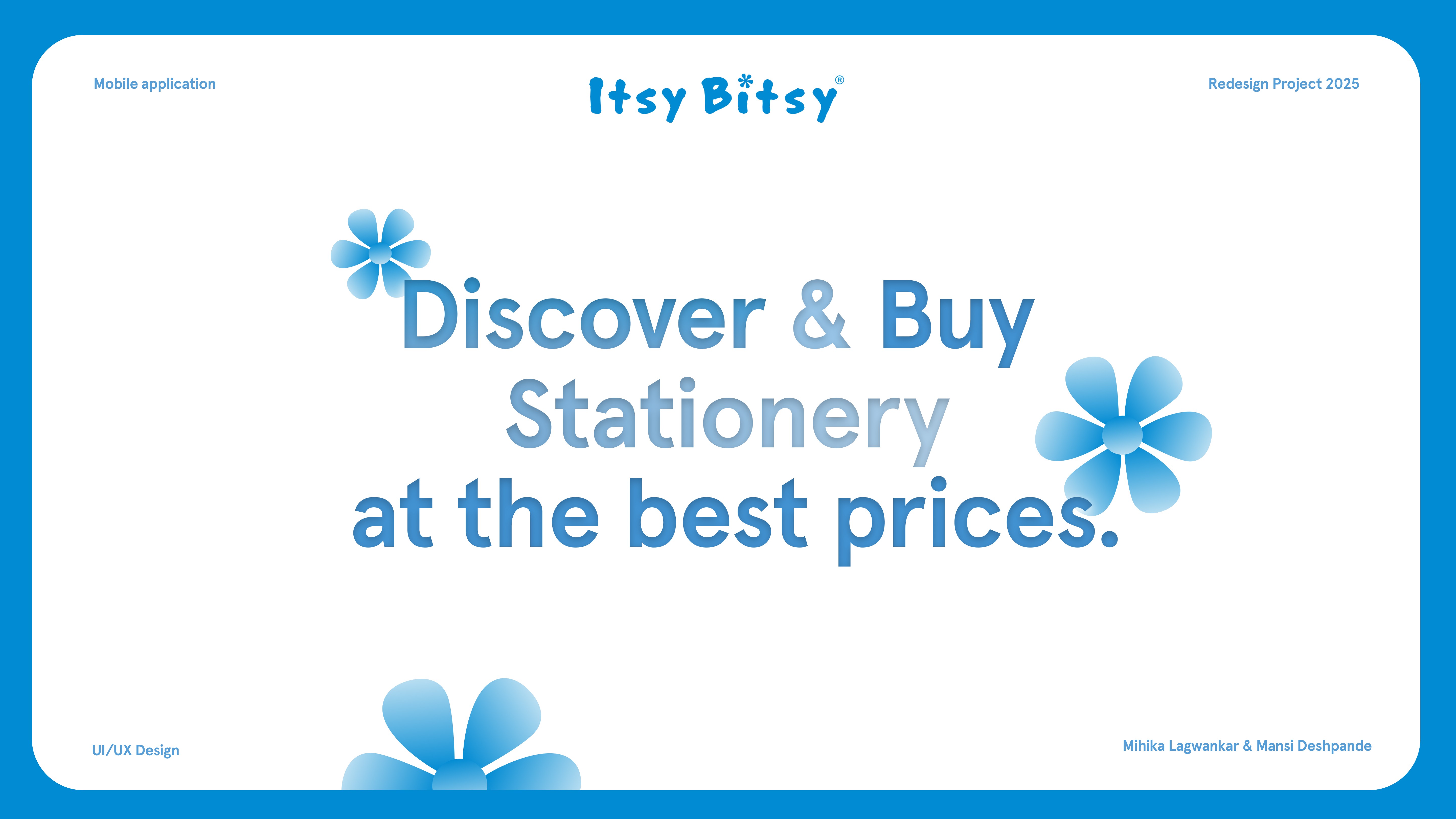
Itsy Bitsy UX Redesign
Where Craft Lovers Go
The Big Picture
Itsy Bitsy, an art and craft e-commerce platform, faced cluttered navigation and high bounce rates. Using a user-centered design approach, we refined the information architecture and improved key shopping flows.

Project Type
Group Project
Role
UI/UX Designer + Visual Designer
Timeline
February 2025-March 2025
Tools
Figma, Procreate, Confluence
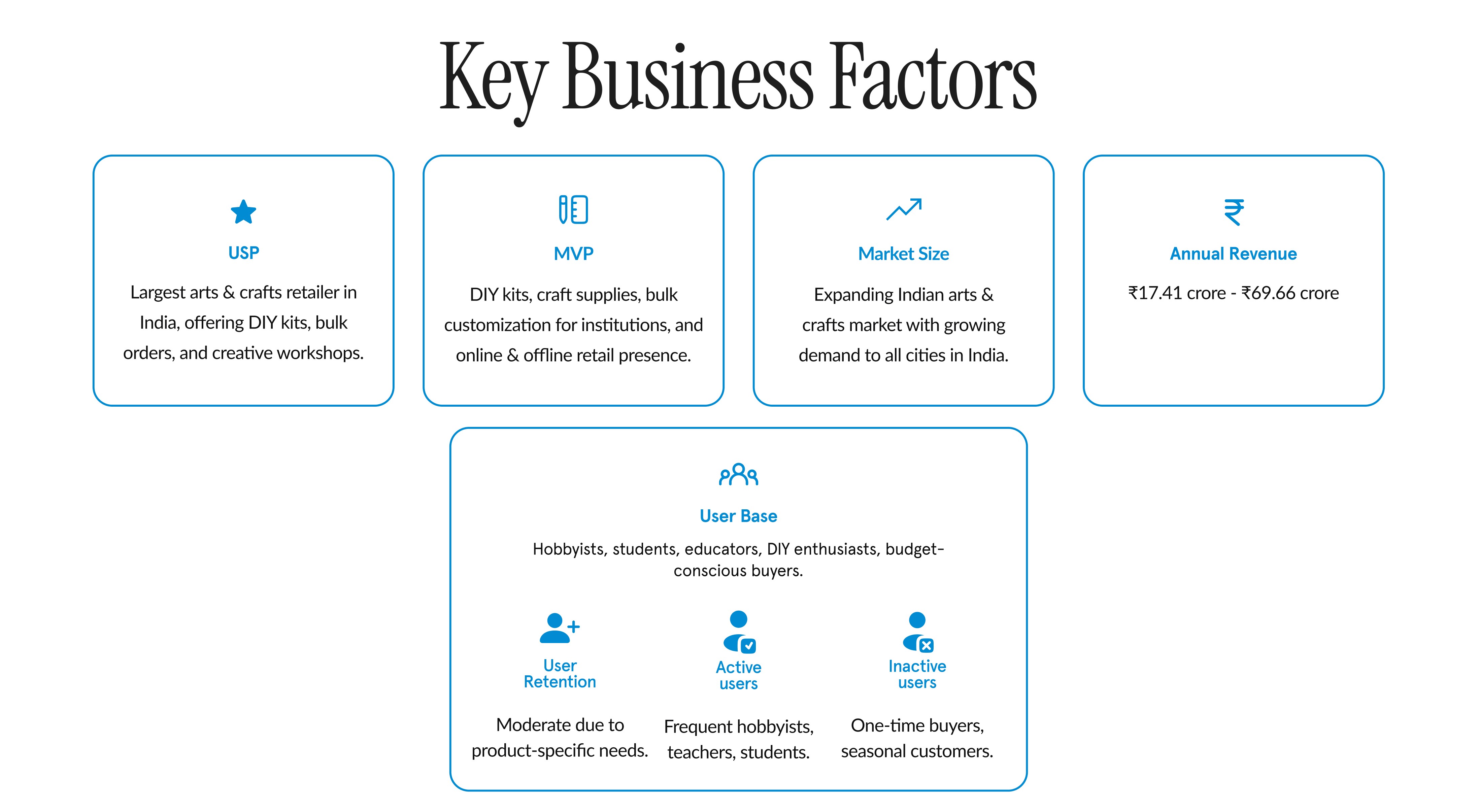
What Itsy Bitsy Offers
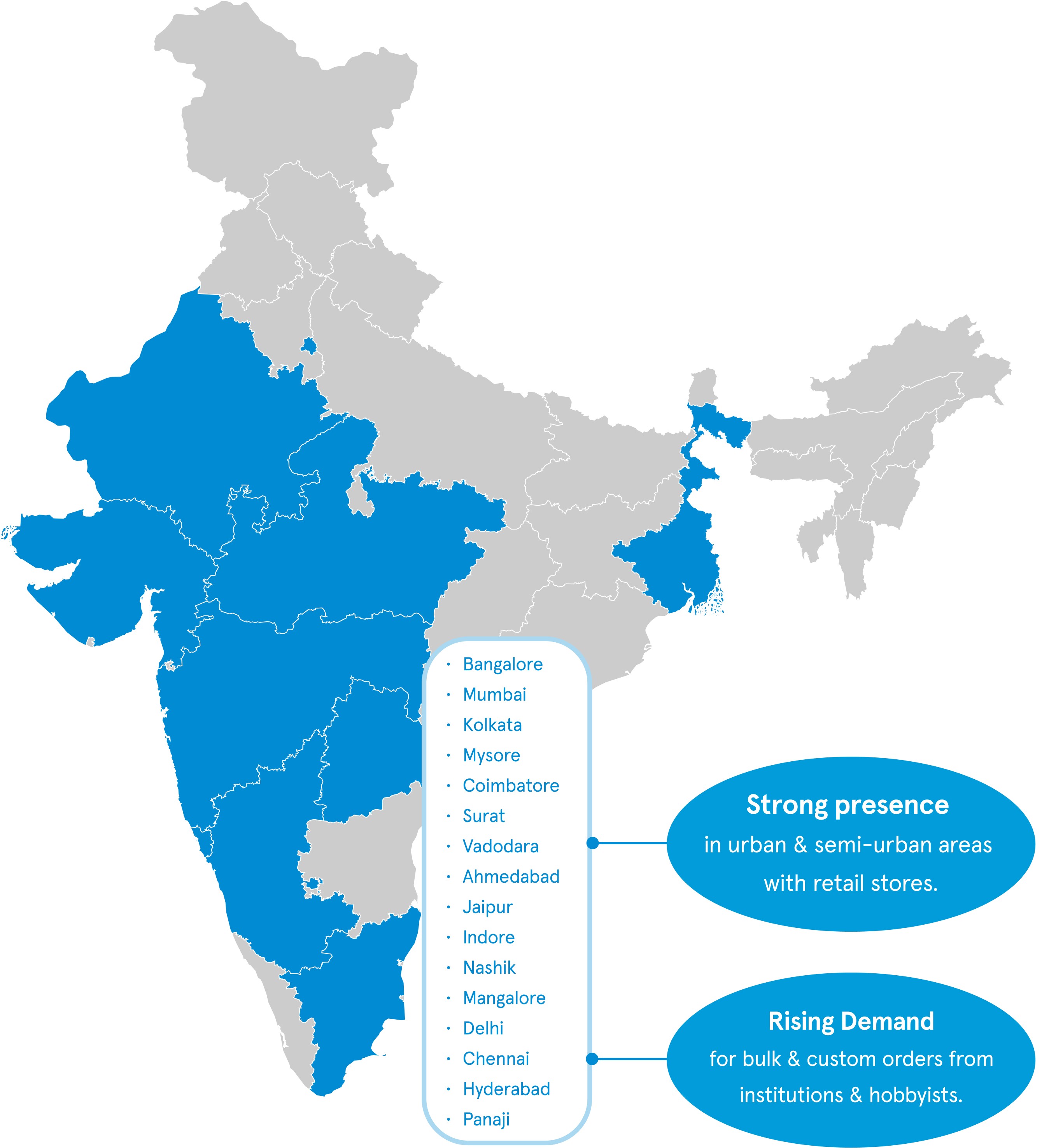
Itsy Bitsy is one of India’s leading arts and crafts platforms, bringing together a wide range of creative supplies, DIY kits, and learning experiences through both online and offline stores.
What the Platform Provides

25,000+ Products
Art supplies, stationery, DIY kits, and craft essentials.

Workshop Sessions
Hands-on sessions that support creative learning.

39+ Stores
A strong offline presence with growing online reach.

Trusted Marketplace
Affordable access for hobbyists and professionals.
Who It's For
Creative learners and DIY shoppers, including design students, artists, and hobbyists seeking easier access to quality materials and workshops.

Target Audience :
18-35 years
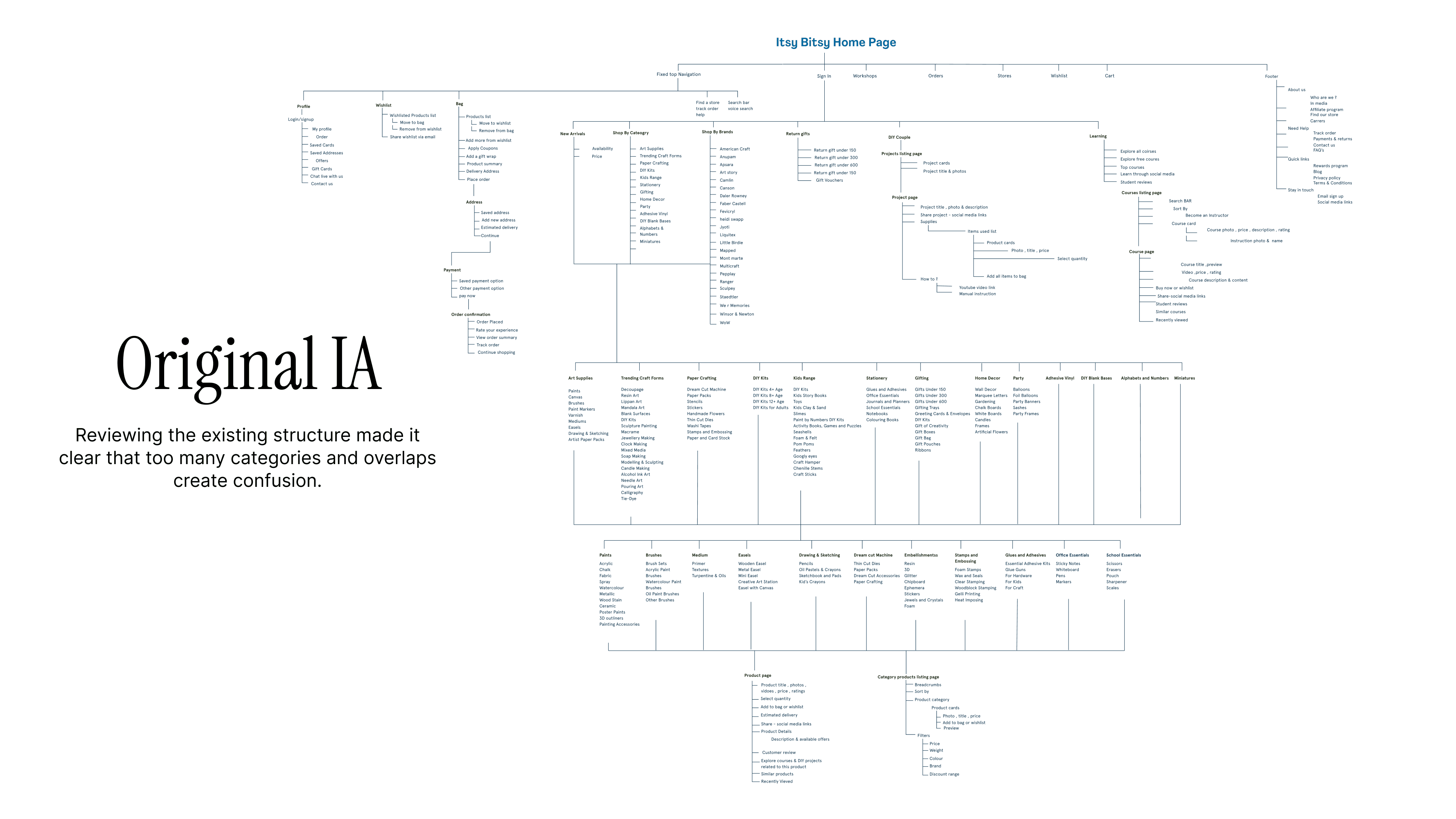
Users felt overwhelmed by cluttered navigation and unclear flows, making it hard to discover products, register for workshops, and complete purchases, which likely contributed to higher bounce rates.
Solution & Results
Creativity, Simplified
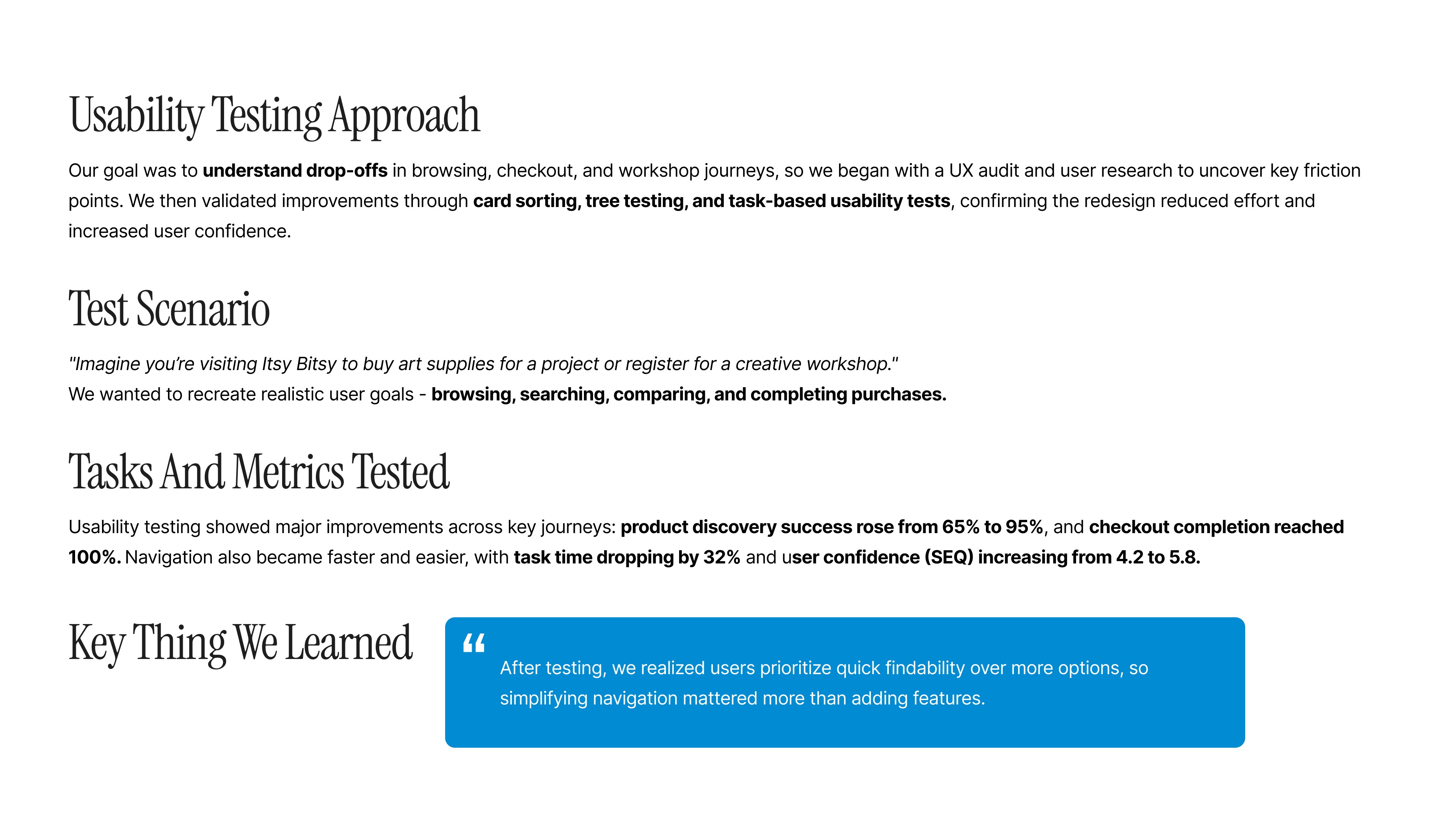
The result was a more accessible and guided journey for creative users. We improved navigation, product discovery, and checkout, validating changes through usability testing, card sorting, and tree testing.
1. Understand
What should we focus on to improve the customer's experience?

This told us the redesign should focus less on adding features, and more on simplifying navigation, discovery, and checkout.
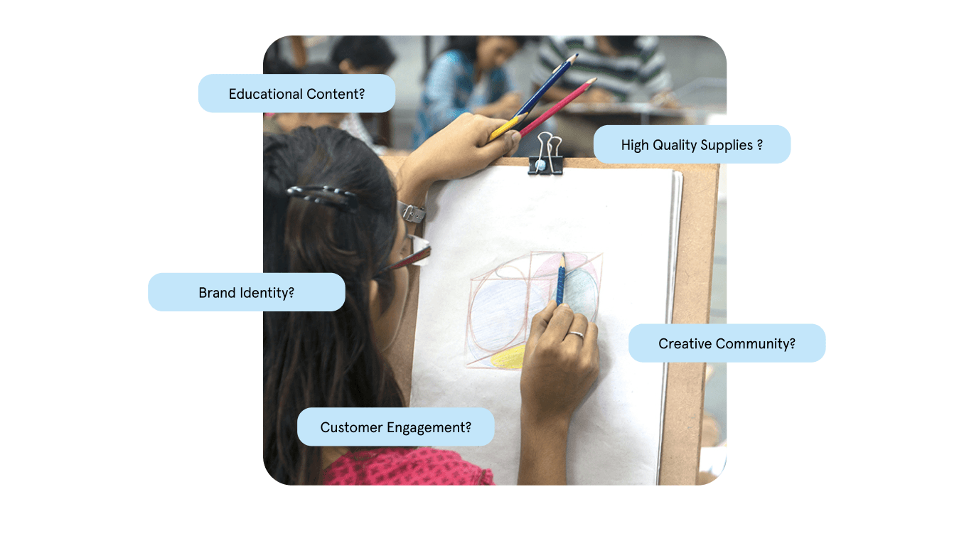
This brand exercise helped us ensure the redesign wasn’t only functional - it stayed true to Itsy Bitsy’s creative, community-driven spirit.
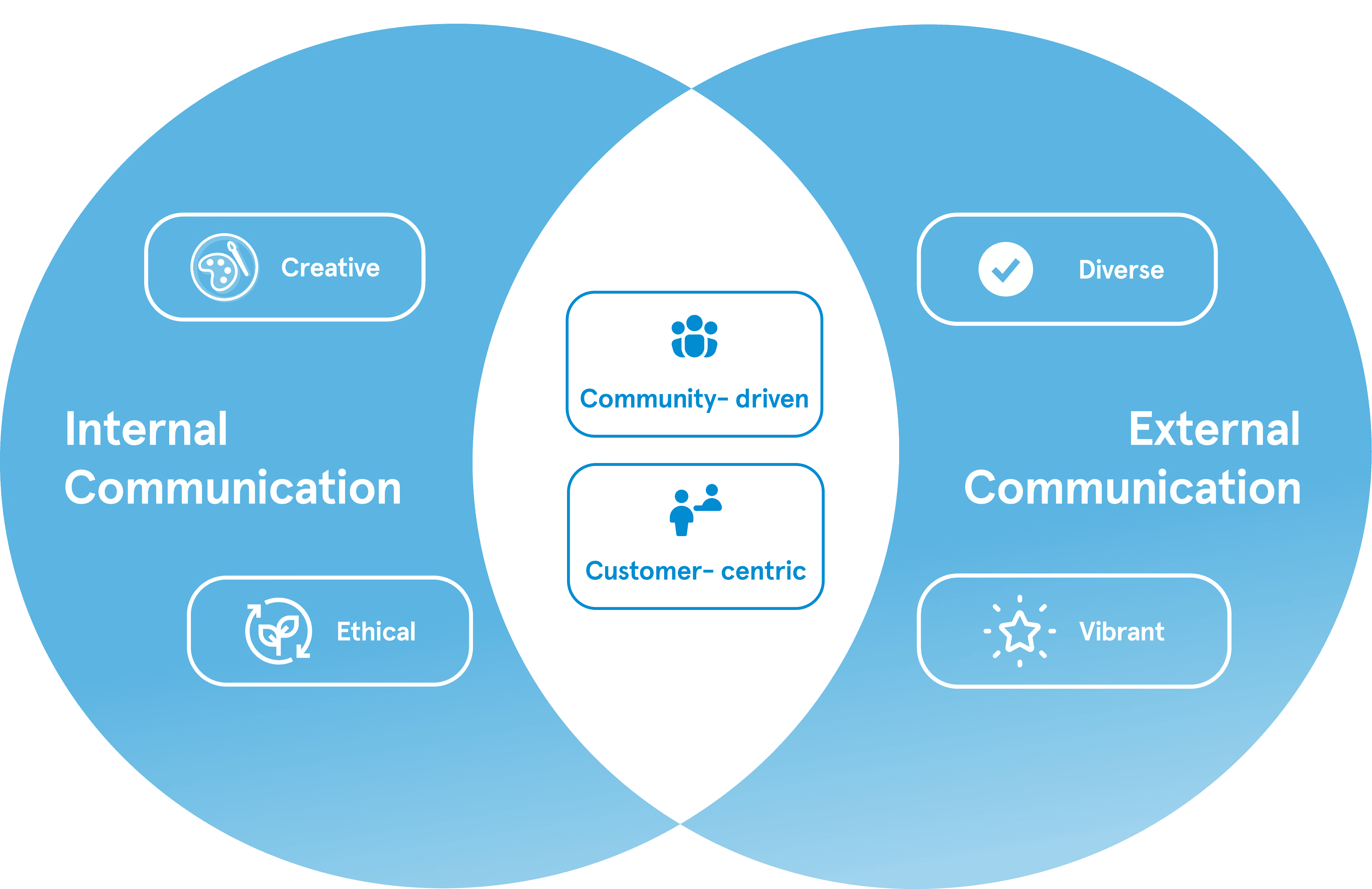

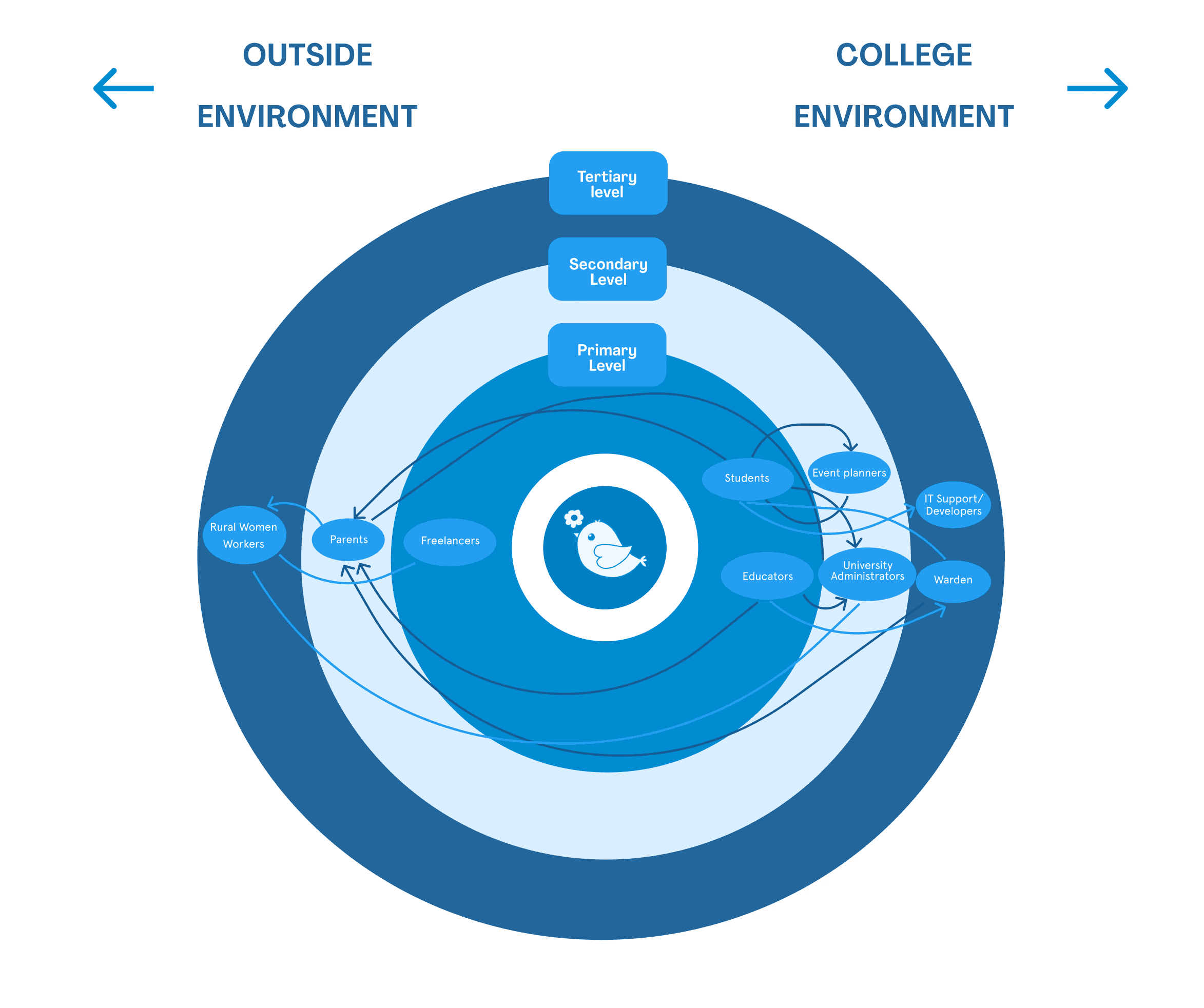
Once we understood Itsy Bitsy’s creative, community-driven identity, we mapped the user landscape to ensure the redesign supports the real people behind this brand.
Creative Audience

Aged 10–45 years

Itsy Bitsy is used by creatives aged 10–45 from students and hobbyists to artists and educators.
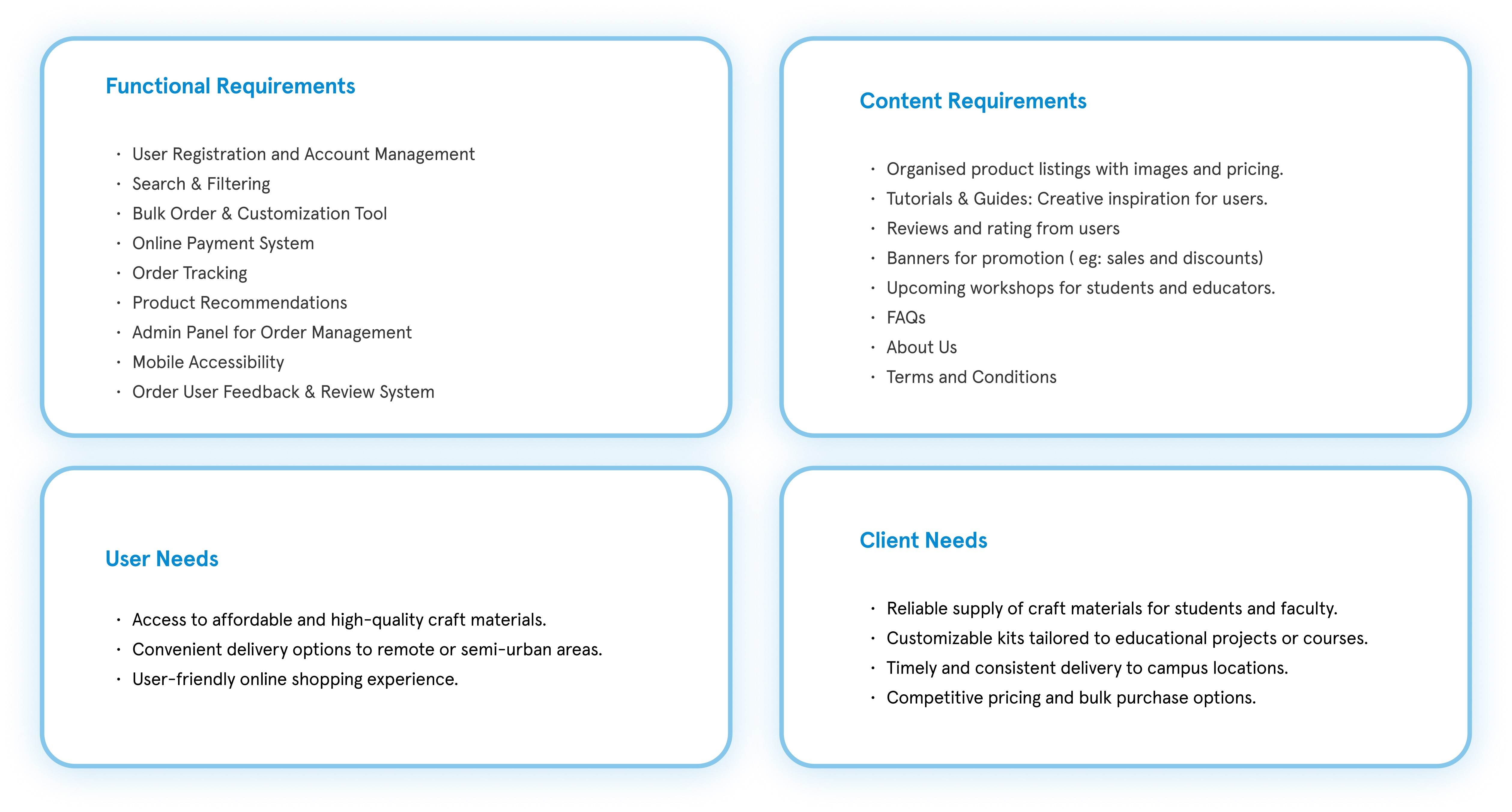
Linking the user landscape with Itsy Bitsy’s mission showed the redesign must be more accessible and guided for students and creators.
Defining these needs clarified what the platform must deliver: guided discovery, trust, and smoother shopping for creators.
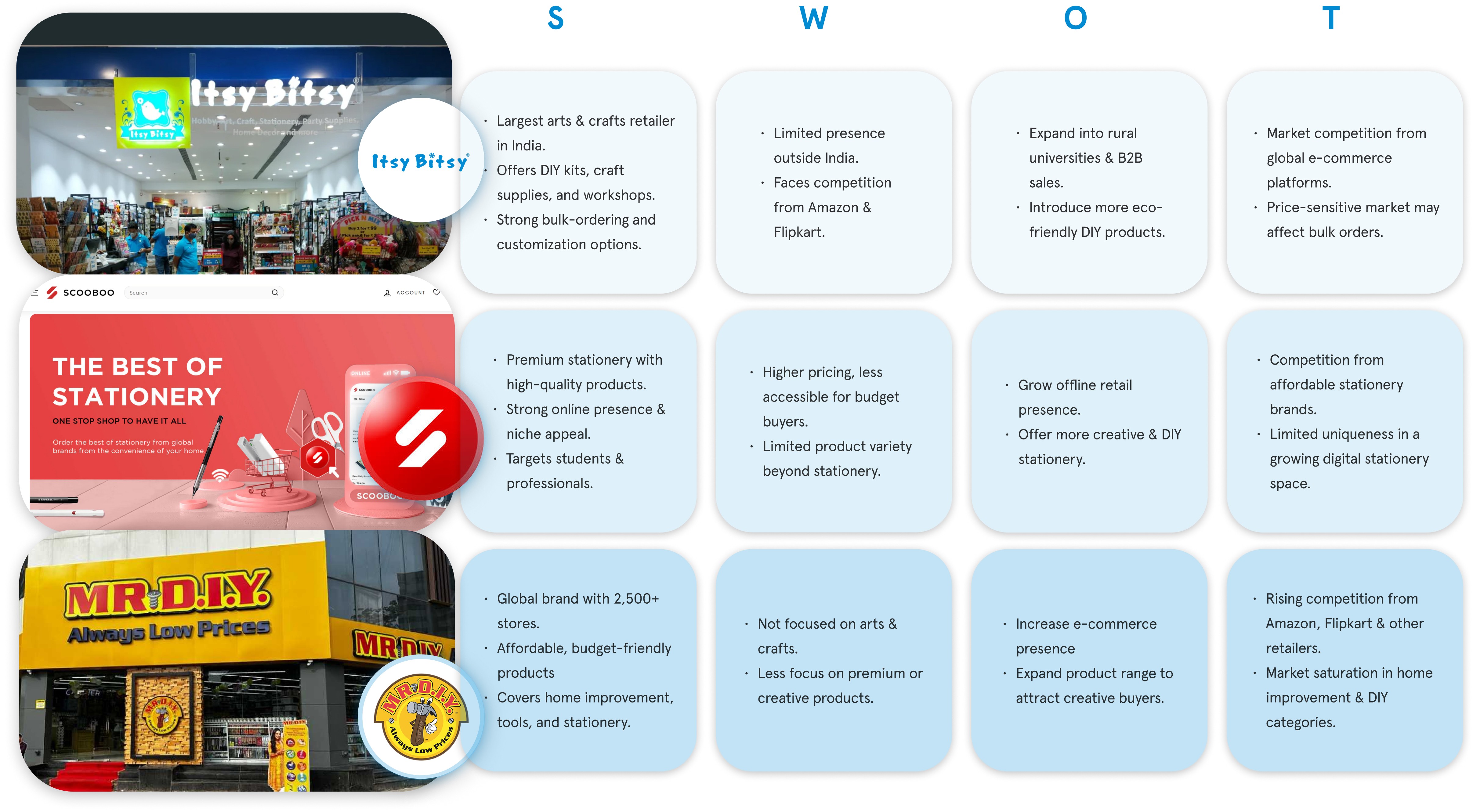
After defining what the platform should deliver, we looked at how users currently interact with Itsy Bitsy in real numbers.
User Platform Interaction
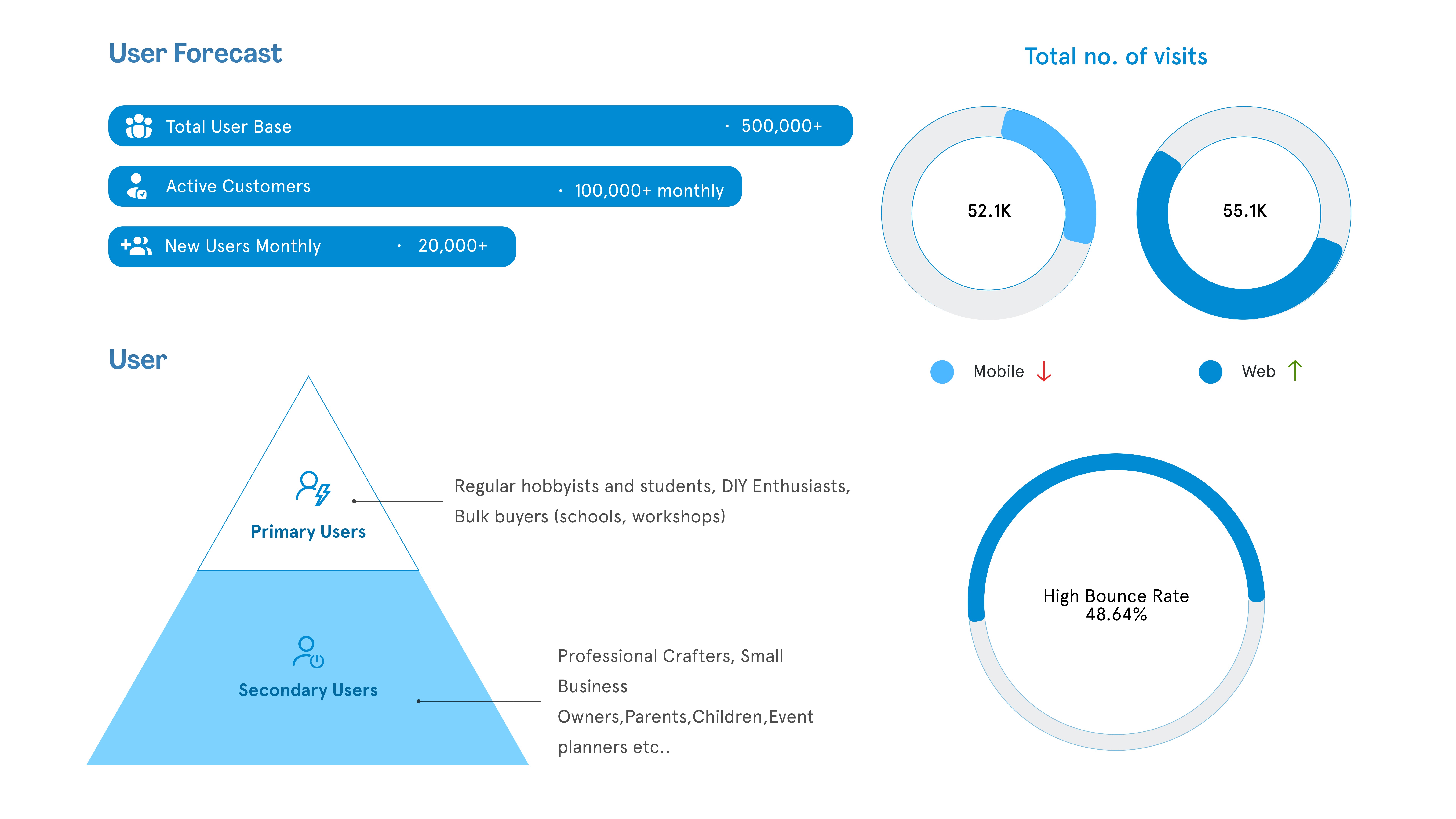
Seeing high traffic but a 48% bounce rate showed that discovery- not demand- was the real issue.
The high bounce rate showed that many users leave before discovering what they need, reinforcing the importance of simplifying the mobile experience.
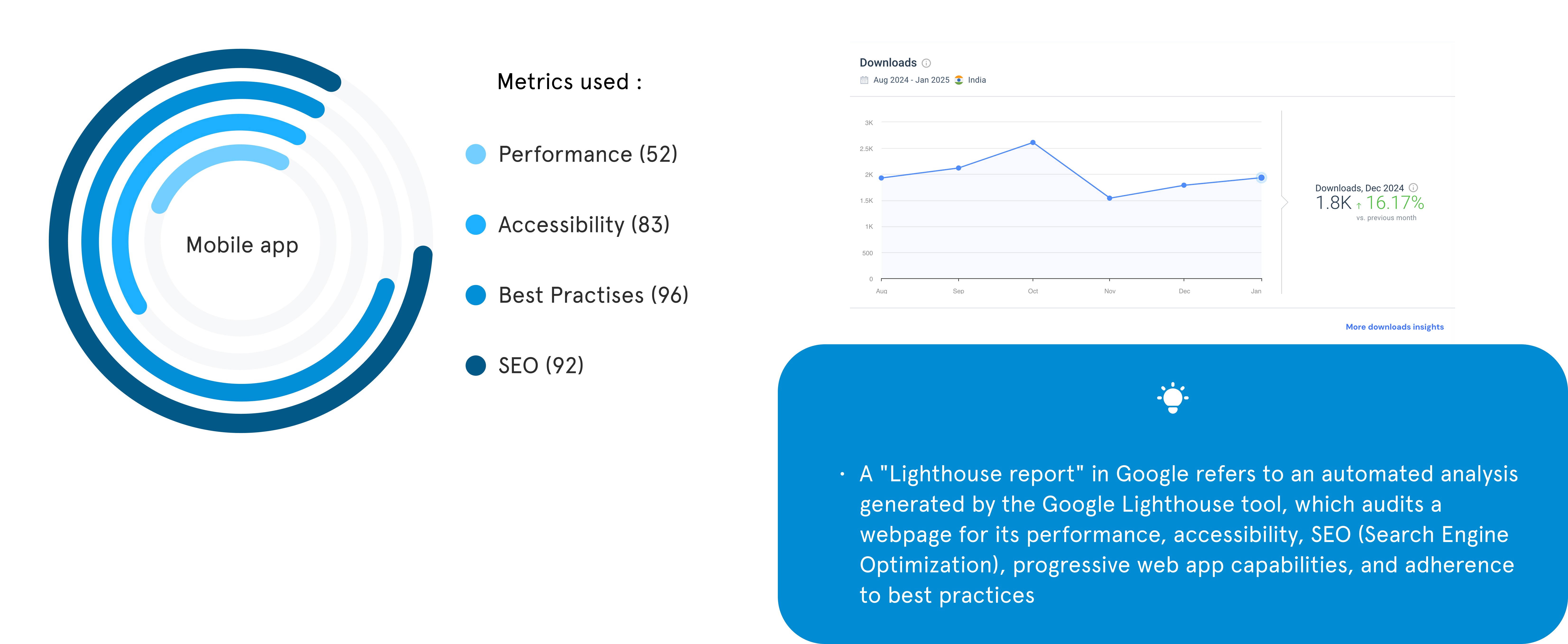
Technological Evaluation
These audits revealed that performance and accessibility gaps, such as slow load times, contributed to early drop-offs on mobile.
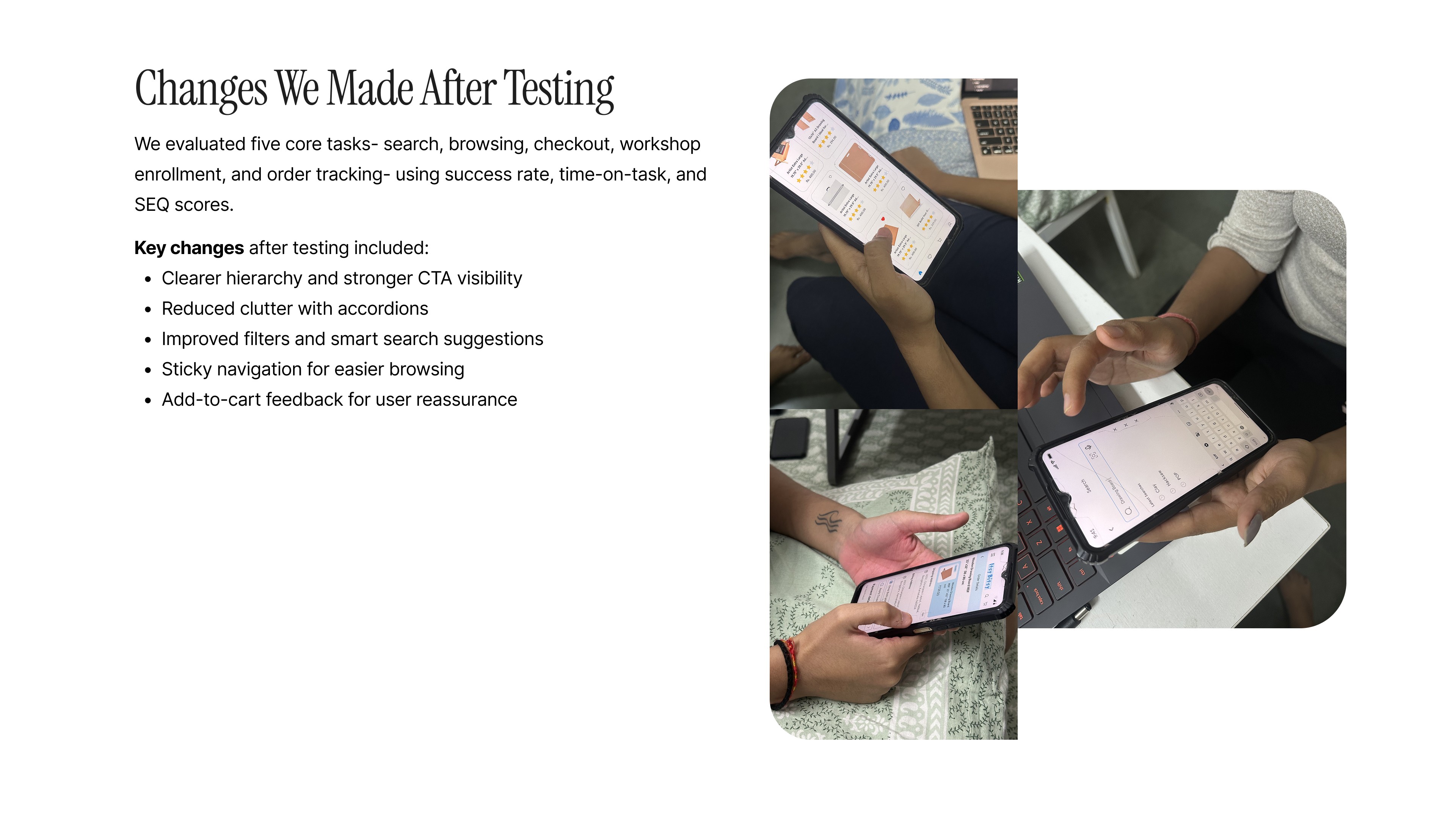
Design Testing
Functionality Improvements
Add customizable kits and smoother navigation to improve discovery.
Communication Enhancement
Refresh visuals to feel more modern and creative.
Technology Upgrades
Improve load times and optimize web + mobile performance.
Brand Evolution
Modernize identity while staying true to creativity and reliability.
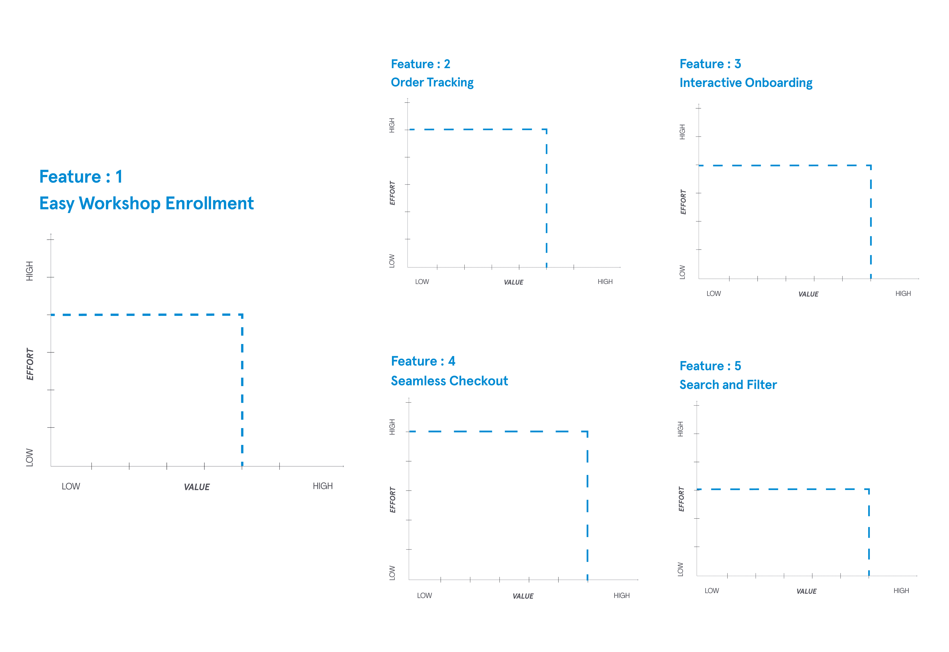
Design testing showed that users didn’t want complex features- they wanted a smoother, faster, and more modern experience with clearer navigation and a refreshed brand feel.
2. Specify
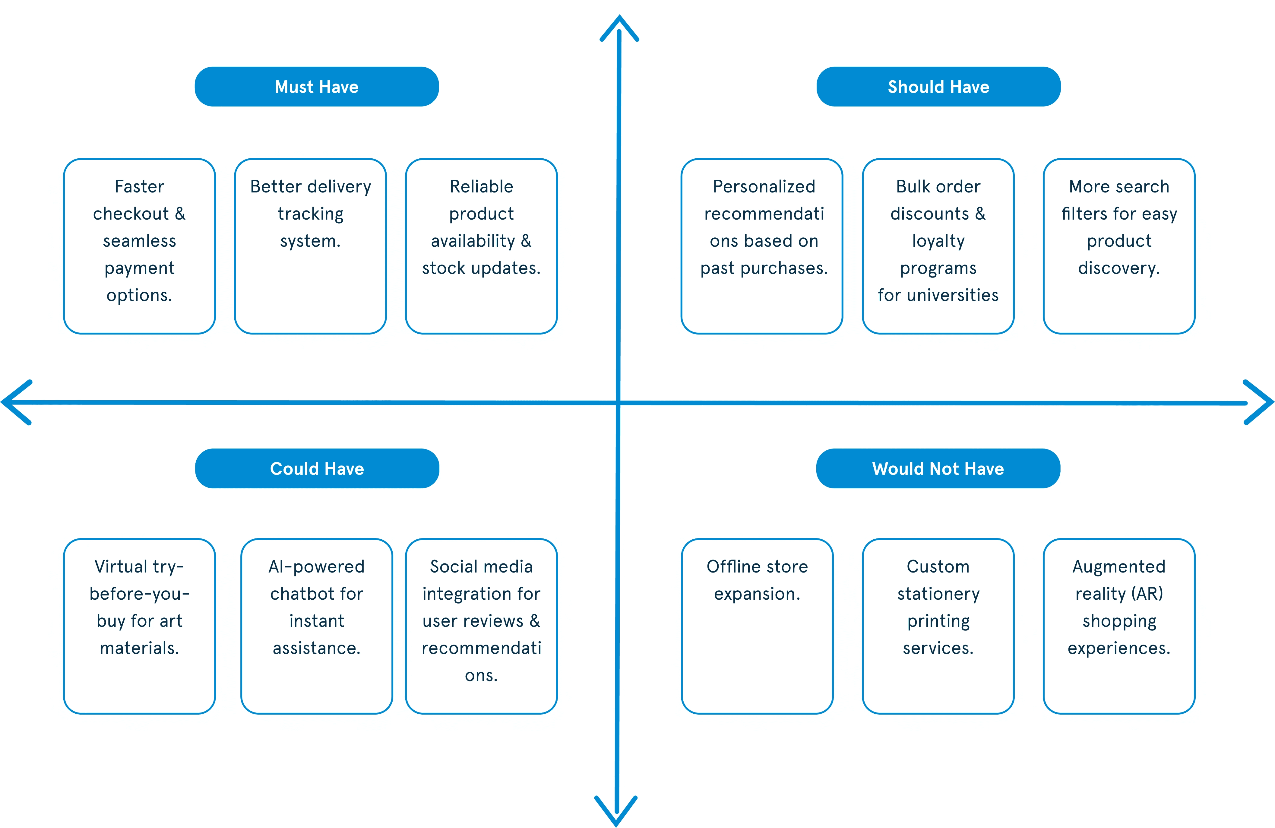
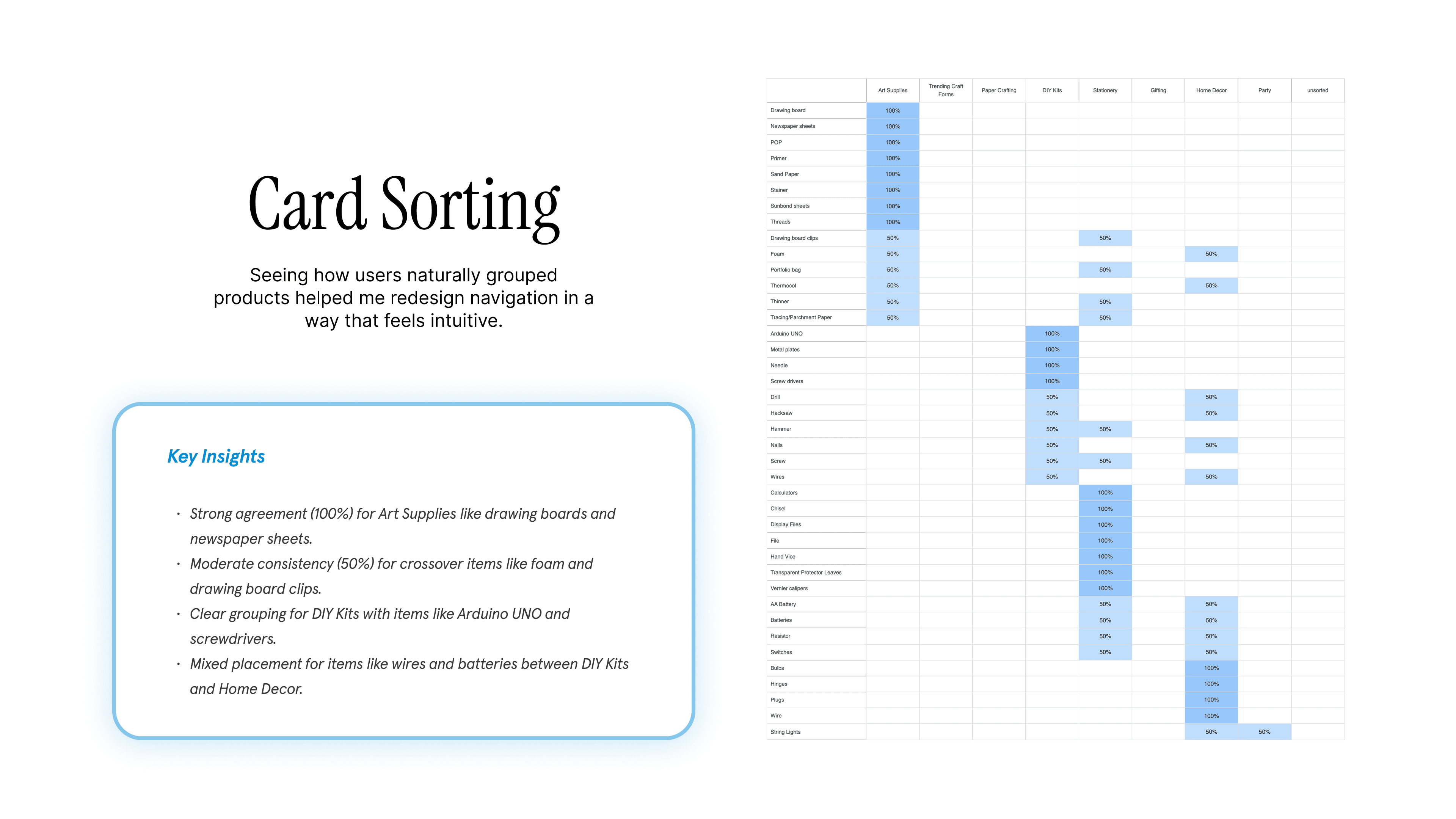
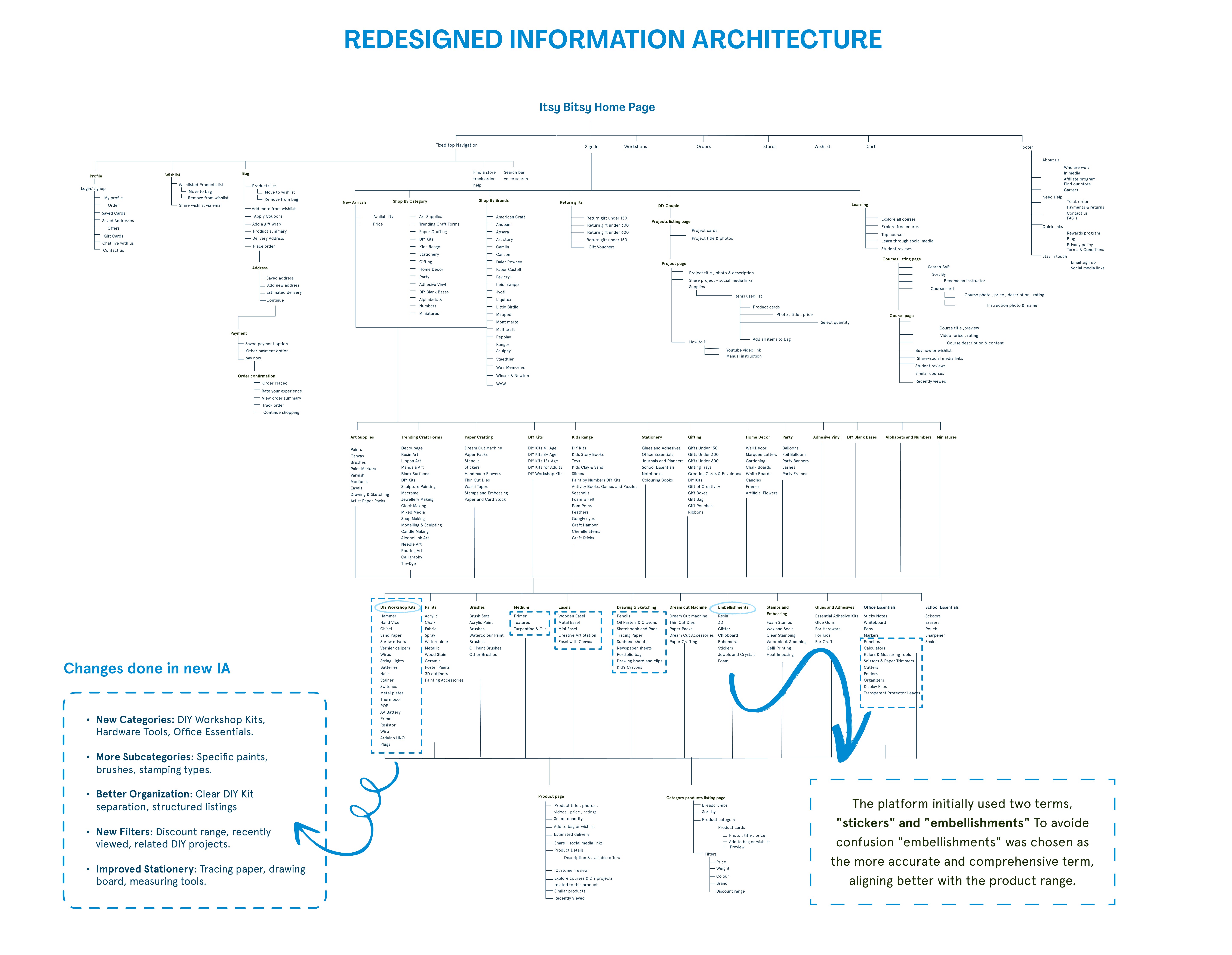
MoSCoW, stakeholder mapping, and card sorting helped define the core UX priorities.
How might we create a clearer, more inspiring experience for students and creators across India?
3. Design
Creating solutions through sketches, flows, and prototypes.


4. Evaluate
Testing ideas with users and refining based on feedback.
Revamped Visual Style
We refined the visual style with brighter, consistent colors to improve clarity and accessibility.
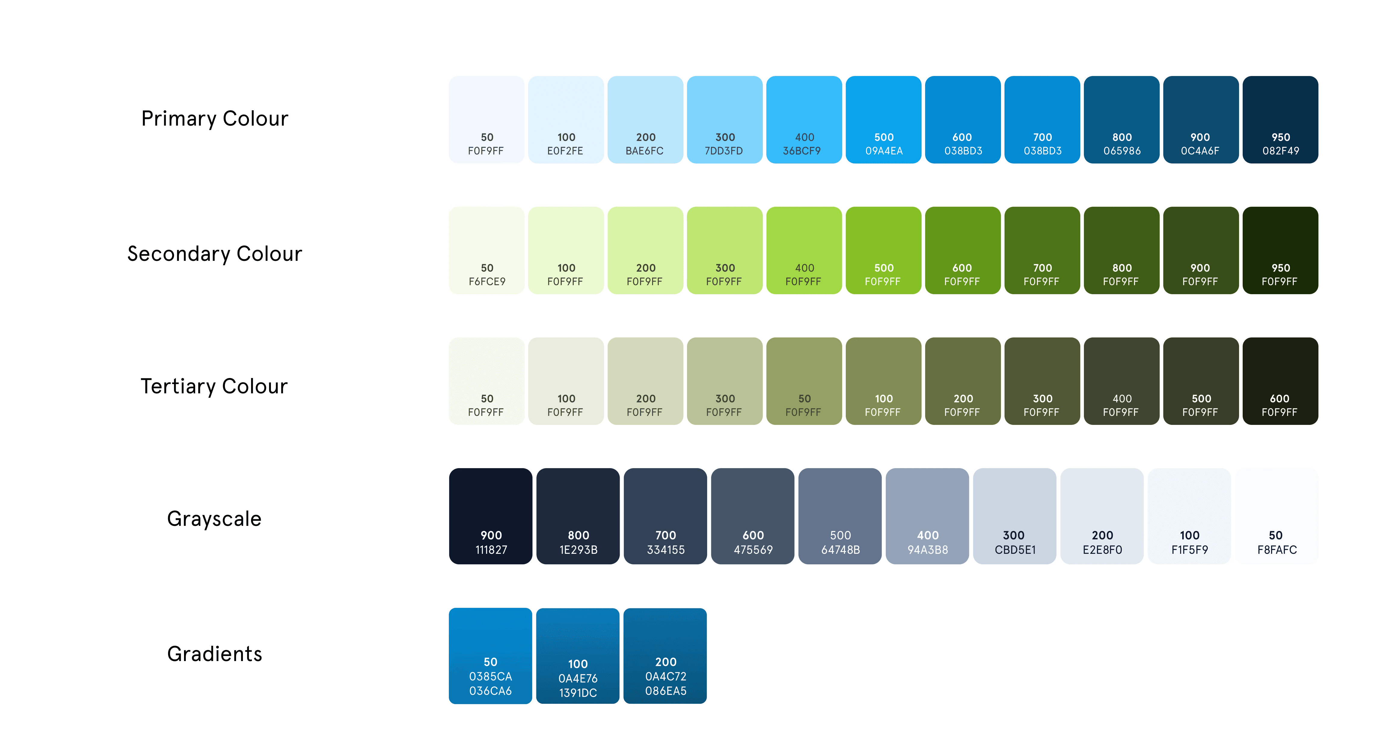
Design System
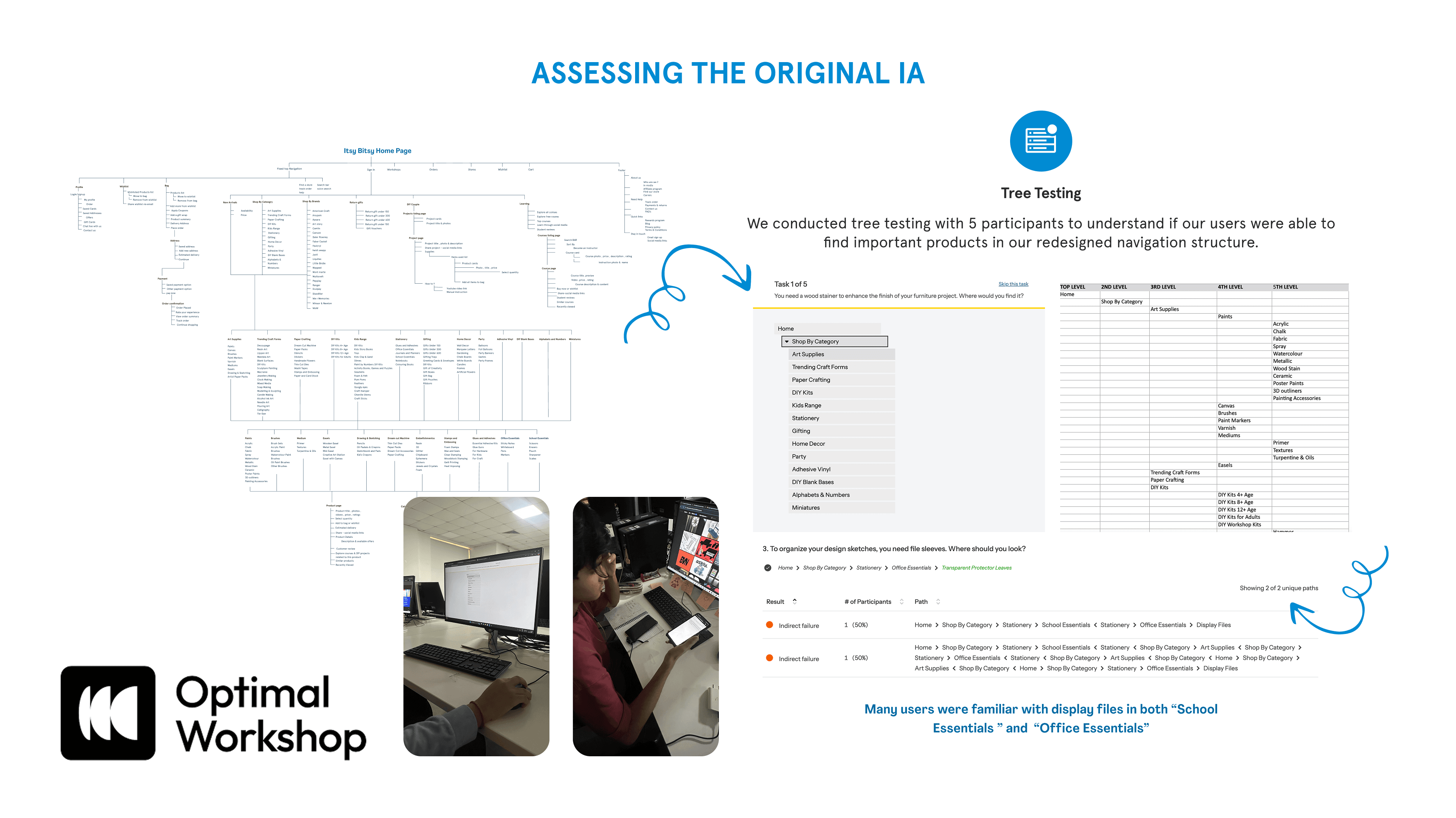
Usability Studies
Reflection and Next Steps
Moving forward, we will refine the prototype across navigation, checkout, and accessibility, test the updated flows with users, and prepare a scalable design system for implementation.
What I Learned:
Small usability gaps like slow load times or unclear navigation can strongly impact trust and engagement.
Users prioritize simplicity and clarity over complex features during the buying journey.
Methods like usability testing and think-aloud reveal friction points beyond analytics.
A strong redesign must align usability with Itsy Bitsy’s creative brand identity.
Next Steps:
Test the refined prototype with a new set of users to validate improvements.
Enhance mobile usability and performance, especially addressing load time and bounce rate issues.
Build a more robust design system to ensure consistency across web and mobile.
Explore smart features like AI recommendations or customizable kits to support different user groups (students, educators, hobbyists).